The COLOUR project (2013) started almost by accident when artist and curator Theresa Bruno was unable to attend a drawing workshop that Sarah Grace Harris was running. As an artist whose work is primarily concerned with found phenomenon, Theresa was particularly fascinated by the focus of the workshop, which was on drawing a collection of green objects using the same or similar coloured media. From then on Harris and Bruno bonded over a mutual love of drawing and more importantly, colour. And, after an initial drawing session, again centred on green objects, both artists noticed similarities between their divergent studio practices and saw the potential for fruitful collaboration.
Harris and Bruno both examine the material world and explore our relationship with the objective world of things to create a new level of perceptual awareness of the subject / object relationship; for the self and for others respectively.
In this direction, their collaborative exploration of colour questions how we engage with, make sense of and categorise the material world. The project helped elicit a heightened awareness of the subjective nature of colour perception, as they and others began to argue about what hue or saturation might constitute a particular colour. Likewise, the process of categorisation also highlights both the arbitrary nature of signification and the slippage between the signifier and the signified; concepts Bruno explores in “Fruit Bowl Painting” (2010). The piece uses alphabetically appropriated paint colour samples named after fruit to create a clinical colour chart and in doing so also brings to account the cynical way in which consumption co-opts domestic discourse as a means of commoditizing the feminine and in turn pacifying the voice of women within patriarchal society.
Colour is something that has been much maligned throughout the male-dominated history of art. It has been derided as surplus to requirements and somewhat frivolous within the disciplines of drawing and sculpture. Indeed, since the Reformation, colour has been seen as degenerative and vulgar; an abortion of the classical ideals of purity of form. Moreover, this Protestant aesthetic is at the root of Modernism. During his early travels, the Swiss architect and design theorist Le Corbusier rejected the colourful world of the Orient for the monochromy of the Acropolis. Upon seeing the Parthenon, he denounces the decoration and chromatic frivolity of the Orient, which he suggests were founded ‘in a narcotic haze’, and instead champions the rationality, purity and cleanliness of white, arguing that it ‘is time to crusade for whitewash and Diogenes’ (1998: 315).
The irony, of course, is that classical architecture and the marble sculptures that adorn it, would have originally been painted in vibrant colours. Likewise, Henry VIII went to such great lengths to remove all traces of colour from the churches and cathedrals of this country that we now forget the role colour played in connoting the opulence and power of the church over the peasants of a diocese. And, to this day, colour has little place in the British aesthetic sensibility. On a purely anecdotal level, when we visit the catholic churches of continental Europe, their contents and décor fall into the debased aesthetic category we know as kitsch.
The colours used in Medieval and Renaissance clothing indicating status, and thus the most valuable dyes like reds and purples were the preserve of the aristocracy and of the church. Yet, like a Chinese whisper on the trade winds, the semantics of colour in Western society have shifted from masculine power to feminine disempowerment. For David Batchelor (2000), colour has come to represent the irrational and the dangerous; its image as ‘feminine, oriental, cosmetic, infantile, vulgar’, proliferated endlessly (2000:71).
Throughout the history of Modernist art, colour has become a cipher for ‘otherness’: insanity (Van Gogh), naivety (Cézanne), orientalism (Matisse), primitivism (Picasso). However, it is also possible that this ‘othering’ of colour has been a way of rehabilitating it as something substantive and not merely decorative. As Batchelor suggests, colour simultaneously represents ‘a lapse into decadence and a recovery of innocence’ (Ibid, 71). Here colour becomes pure experience; that of a newborn child; unmediated by the subjective self that is produced by language.
Further to this, Batchelor highlights the ‘inadequacy of words’ in representing colour, suggesting that ‘we reach outside of language with the help of a gesture. We point, sample and show rather than say’. And in doing so ‘we expose the limits of our words’ (Ibid, 85). So colour becomes that which will always be other to the unified subject as it can neither be truly named nor owned.
Yet perhaps it is colour’s intangible mysteriousness, which leads to its marginalisation. Julia Kristeva (1982) makes the link between colour and abjection. Likewise, Mikhail Bahktin opposes the unified, self-contained form of classical sculpture with the grotesque body of the Medieval peasant, in all its visceral brutality, baseness, crudity, un-cleanliness and carnality. Colour’s “otherness” gives it a “carnivalseque” power to undermine and challenge the established symbolic order. Indeed, it plays an important role in the Medieval carnival. The “fool king” or “king for a day” was dressed in a harlequin mismatch of colours to symbolise chaos and disorder – of social or symbolic order; of the mind? Further to this, Batchelor, also suggests that bright colours bring to mind court jesters and clowns and ‘to be called colourful is to be flattered and insulted at the same time’ (Ibid, 67); a level of ambivalence that is a prerequisite of the carnival.
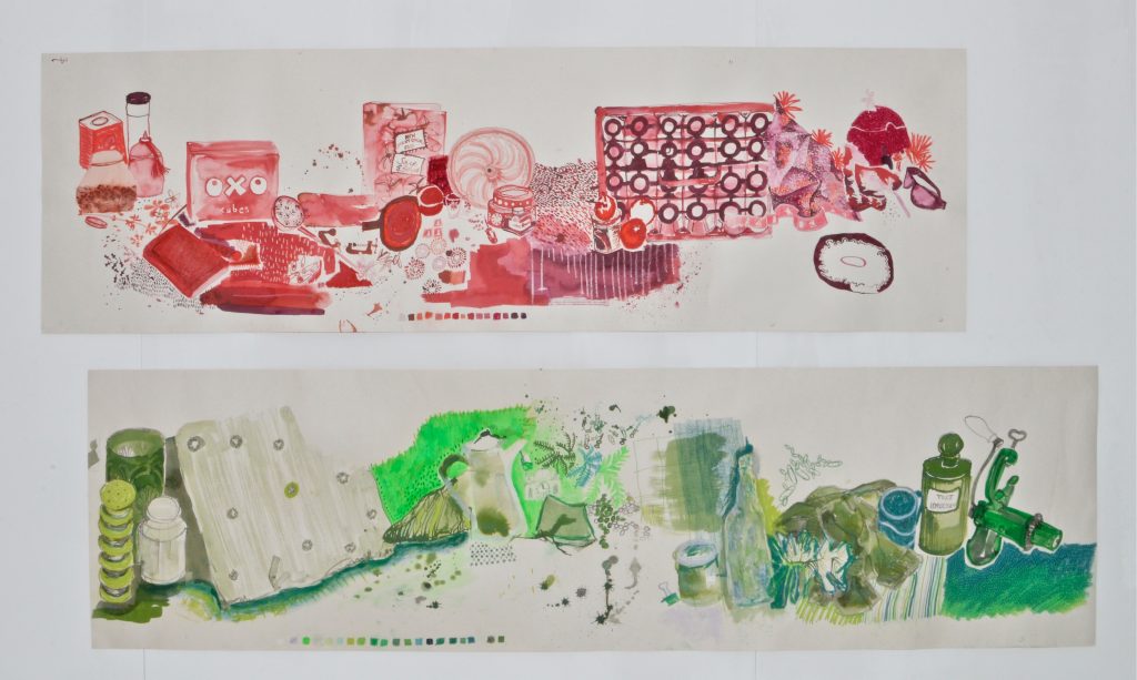
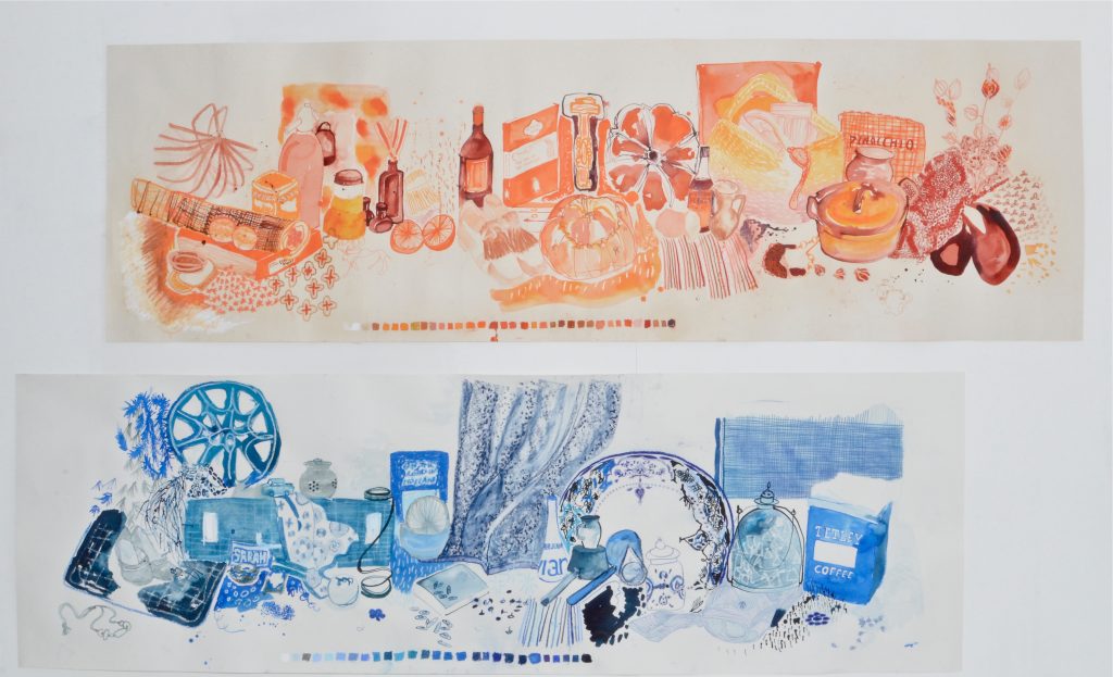
Looking back on the COLOUR project, one of the things that stands out as important is its use of domestic objects. Early on Harris and Bruno made the decision to only use objects that they already had at home. This again reinforces the notion of colour as both decorative and feminine. However, in their choice of objects, Harris and Bruno have highlighted one of the great tensions in art history: that historically, the domestic space has been represented by men. This also exposes a binary between masculine and feminine that is reinforced by consumer discourse. While women nominally have ownership of domestic space, it is men who have ownership of the means of production. Here we see a duping of women into believing that they are producing domestic space, when they are in fact merely consuming it. The man as “bread winner” allows the women freedom to produce the domestic space; an act which becomes nullified by its entwinement with masculine ownership: from the designer to the husband who sanctions this wanton consumerism as a means of satiating and pacifying the woman’s need for agency. What Harris and Bruno do, however, is to rehabilitate ownership of the domestic realm by taking these biographical items from their original context and re-contextualising them as both familiar and alien. In other words, by engaging with these objects in a heightened state of aesthetic awareness, Harris and Bruno both reinforce their magical power as personal fetish objects and imbue them with new mythologies and meanings, which question that which we already know about them.
In this sense, this project re-familiarises us with the meaning of art: that through aesthetic and intellectual enquiry, we are able to see things afresh and to break with habitual ways of seeing and being. Ultimately we can only learn about colour through engaging with it; through focused creative play. Therefore, it is perhaps best to view the work produced so far as the start of an ongoing journey rather than the end of one.
Bevis Fenner